We have started to sketch the DATA (i.e. to think about how data will flow through our system).
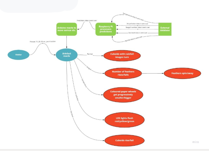
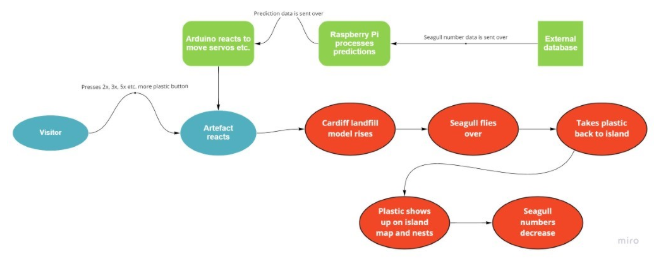
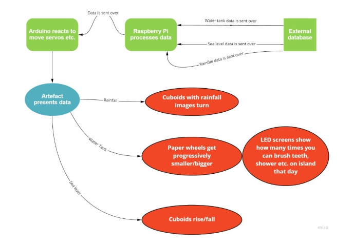
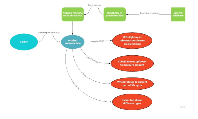
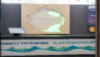
The above details the Data Flow Diagram (DFD) for Cardiff’s traffic data that will be incorporated into the data physicalisation. It shows a scenario in which a visitor presses a button that will show the effects of Cardiff’s traffic on Flat Holm in 10 or 20 years, for example, given that the current trajectory for traffic rise or fall is followed in the coming years. Any data that is relevant to the traffic scenario is sent over from the external database or server, which includes the numbers of seagulls and slow worms on the island, the air quality and the sea levels to pick a few. These would then be processed in order to create predictions for the future, and these predictions are what would be shown on the artefact. As shown in the DFD, a number of different physicalisation techniques would be on display, from the numbers of feathers increasing or decreasing to represent how many seagulls are expected to be around to the LED lights flashing to indicate how the air quality is predicted to be. The purpose of this interactive element is to make the visitor think about their behaviours and to make them realise that they have an effect on the island.


0 Comments