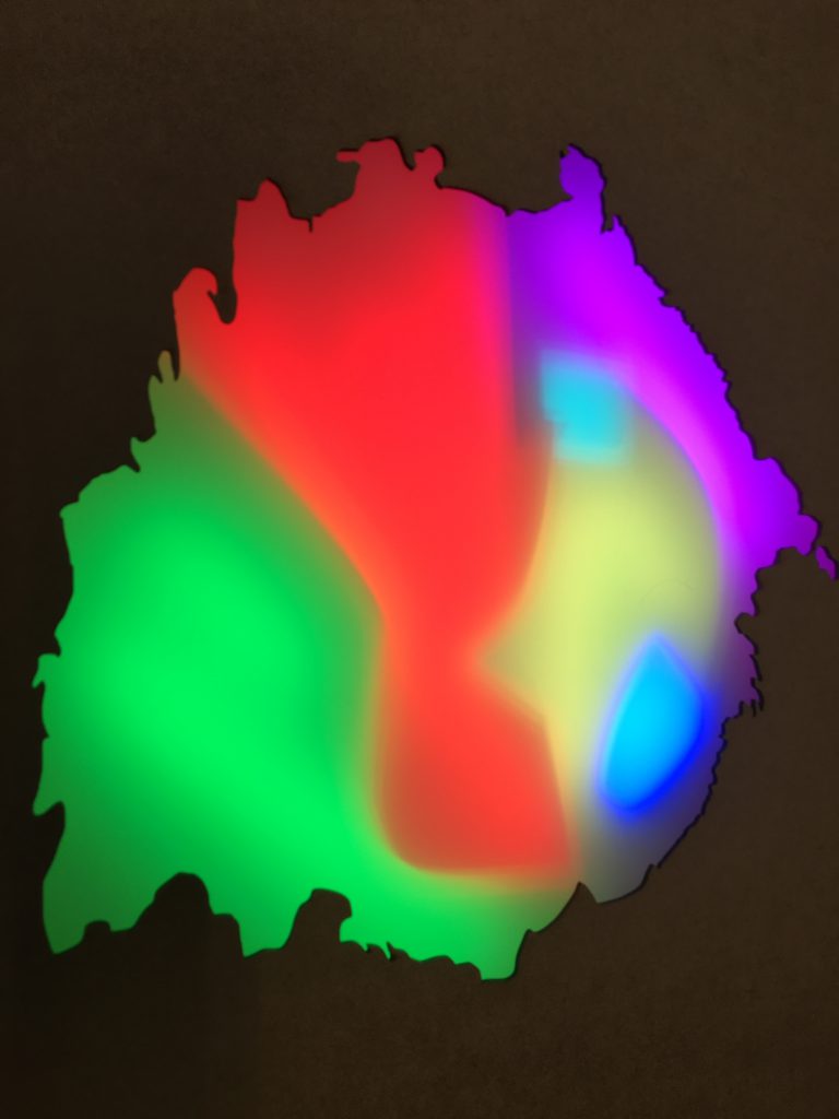
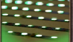
Spot the difference. We are looking at what aesthetically works better.. a sharp clean line/ division between the colours or a slightly more blurred division. Either way, we are delighted to see some really vibrant colours coming through.
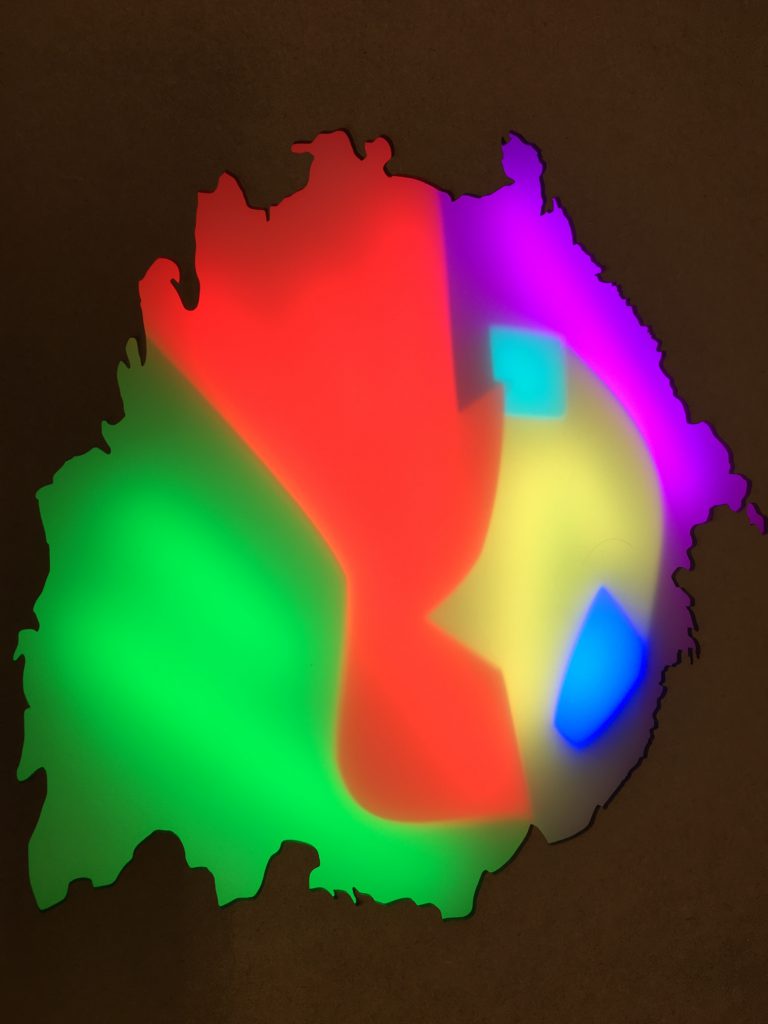
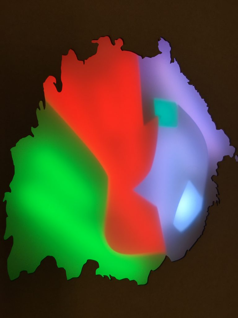
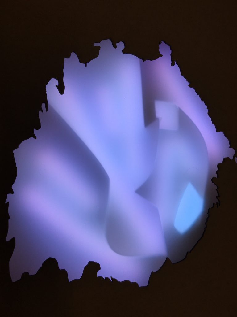
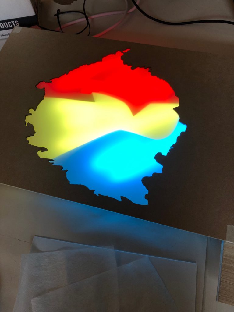

Spot the difference. We are looking at what aesthetically works better.. a sharp clean line/ division between the colours or a slightly more blurred division. Either way, we are delighted to see some really vibrant colours coming through.
Thank you to everyone that worked on the DAPTEC Flat Holm project and to all the kids from Mount Stuart primary school, Cardiff that helped us test the exhibit.

We have reached the next phase of our project where people are starting to interact with the exhibit. Some really interesting feedback is filtering back to us.
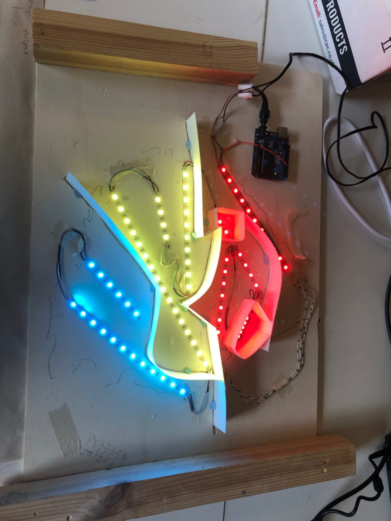
We needed hundreds of LEDS to make our interactive map work… but it was well received once we got it working.

0 Comments